Informative folder and a guideline about the convention of children’s rights. Illustrations: Tina Lundgren / Copy: Susann Swärd / Layout: Karin Backlund
A guideline for audult
about children’s rights
Client:
Rättighetsfokus,(www.rattighetsfokus.se)
A competence company within human rights that and aims to increase people's understanding and knowledge of human rights in everyday life and daily work of various businesses. Rättighetsfokus produces handbooks and children's books that in a simple and practical way concretize different rights in everyday life.
brief:
An informative folder, 8 pages, with the purpose to guide, educate and enlighten adults about children’s rights and make it easier to adopt these laws into work places where it is needed. The folder consist of illustrations, modules, tables, informative text and paragraphs with questions to work further with for the reader.
my work:
- Layout
- Adjusting illustrations
- Prepare files for printing house,
website and different uses
THE TEAM:
Author:
Susann Swärd
Illustrations:
Tina Landgren
Susann Swärd
Layout:
Karin Backlund
TIME FRAME:
spring, 2020
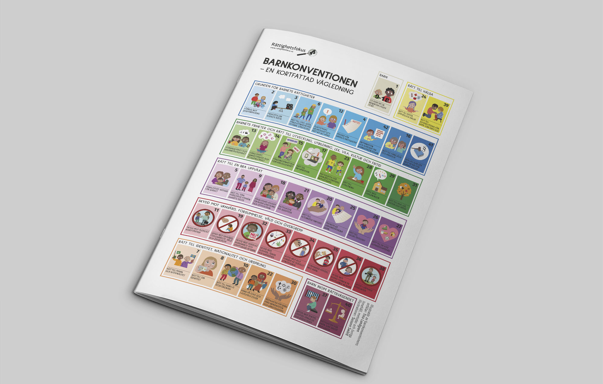
Front page of the folder “Convention of children’s rights, a guideline”, 12 pages
Cover of the folder “Convention of children’s right, a guideline”
" It should not be difficult to learn and remember
 the conventions of children’s rights
 and adapt them to a daily work life “
The idea:
The purpose of the folder is to guid, educate and inform adults about the convention of children’s rights. With informative text and many illustrations presented, the folder should however be easy to read, understand and feel light.
THE WORK:
When putting all content together the 8 pages draft went into 12 pages to be able to present all the contents, make the illustrations bigger in size, have more space and make the overall layout looking more orderly.
The illustrations of the models needed to be redesign in higher resolution for printing, which I did in close cooperation with the client. Also some of the articles illustrations needed to be changed due to low contrast.
The big challenge was to make illustrations and text in the whole folder to feel as they belong together with still limited of space.
The work with the folder involved layout, typography, corrections in illustrations, re-illustration models, proof reading and finally sending a bunch of different files to the client, to be used on website, sending to printing house, lecture material etc.
the design:
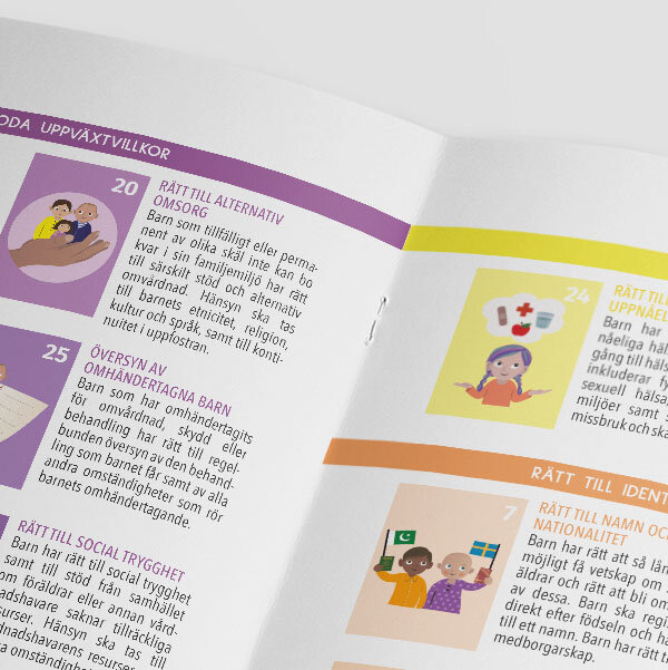
The folder should be informative as well easy to read. The target is adults but the subject is about children. The layout should therefore representative both grown up people as well as the children themselves. This is done by letting the illustrations be childish and full of colour together with a font that is soft but more strict. To make sure all childish illustrations and adult models go together visually, I had to redesign the models and make them more soft and add colours but still have a more adult touch.
Since the folder contains a lot of text and different style of chapters, a clear layout was needed to keep all pages together as one folder. This was made by adding a clear alignment and structure throughout the whole folder and in the same time with playful colours. Light blue boxes were added to make some specific paragraphs pop out and a blue ribbon was placed in the footer, which also connect this folder to other books the same organisations has published.
The typography in both headlines and body text is based upon linear fonts to make it easy to read but also look clean. Different sizes is used to create hierarchy of the text. The same fonts can also be find in other published material from Rättighetsfokus. All text used in the illustrations/models have the same font, to make them belong together but still not the same fonts used in headlines or body text.
Since the folder both should be sent to printing house and be printable from a website, the setup was different depending on who will print it., professionals or ordinary people. The margins and footer was therefore made in two versions. Also some illustrations needed to be changed for those who will print the folder in black and white.


